The only guide you need for creating an outstanding architecture portfolio
Are you an architect struggling to make your portfolio stand out in a sea of competition? We've gathered insights from top industry experts to bring you the ultimate guide to crafting an architecture portfolio that will catch the eye of recruiters and potential employers.
Are you an architect struggling to make your portfolio stand out in a sea of competition? You’re not alone.
We’ve gathered insights from top industry experts to bring you the ultimate guide to crafting an architecture portfolio that will catch the eye of recruiters and potential employers.
Let’s dive in and transform your portfolio from good to outstanding!
The Anatomy of a Winning Architecture Portfolio
1. A Powerful First Impression
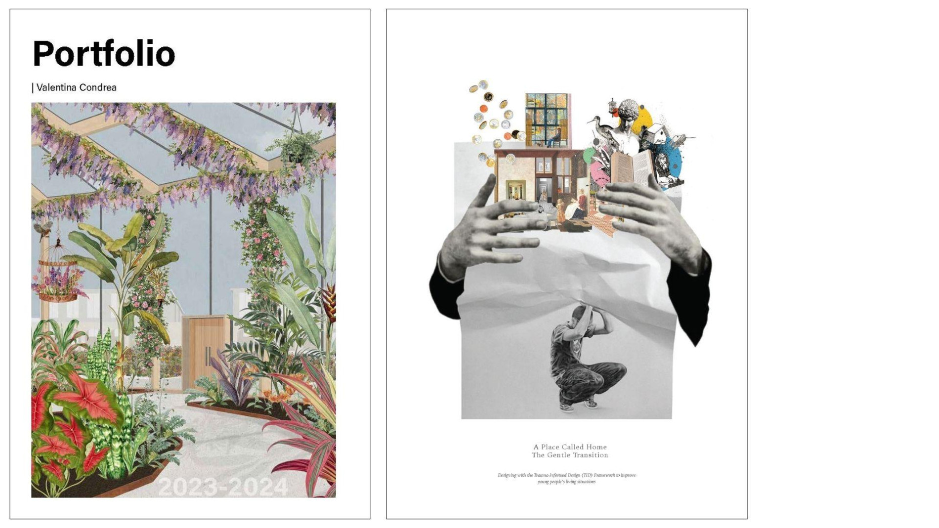
Your portfolio’s first image is essentially your handshake with the viewer—it needs to be strong and memorable. The cover and opening pages are your opportunity to grab attention and set the tone for the rest of your work.
Do this: Choose a striking image that encapsulates your design philosophy or showcases your best work. A bold, abstract representation or a well-rendered signature project can create an inviting entry point.
Avoid: Generic images or cluttered layouts that can confuse or disinterest the viewer.
Pro Tip: Design multiple versions of your cover and get feedback from peers or mentors to choose the most impactful one.

Do this: Create a visually striking cover that represents your design style and invites further exploration. Consider using a signature project render, a collage of your best work, or an abstract representation of your design philosophy.
Don’t do this: Use generic or unrelated images that don’t showcase your skills. Avoid cluttered designs or overly complex layouts that might confuse the viewer.
Pro Tip: If you’re unsure about your cover design, create 3-5 different versions and ask for feedback from mentors or peers in the industry.
2. Curate Your Projects Thoughtfully

Karen Fugle advises against strict chronological ordering. Hiring managers are often looking at 100+ portfolios a day, so it’s crucial that you make that first impression count. Your first project sets the tone for your entire body of work. When deciding on which project to put first, Karen says, “It may not necessarily be your best work, it may be work that taught you the best lesson, or best showcases your ability to work in a team.” Start with a story that lets the employer know who you are.
Do this: Curate your projects carefully, prioritising those that best represent your abilities and design philosophy. Aim for a mix of project types and scales to demonstrate versatility.
Don’t do this: Include every project you’ve ever worked on without consideration for quality or relevance. Avoid showcasing multiple similar projects that don’t add new information about your skills.
Pro Tip: Create a project matrix to help you select the best works. List your projects on one axis and key skills or attributes (e.g., sustainability, innovative use of materials, complex problem-solving) on the other. This will help you identify which projects best showcase your diverse talents.
3. Balance Visuals with Context
While stunning visualisations catch the eye, context is crucial. Sana Tabssum suggests, “Ensuring that there’s a narrative for each page and it all tells a story is really important.”
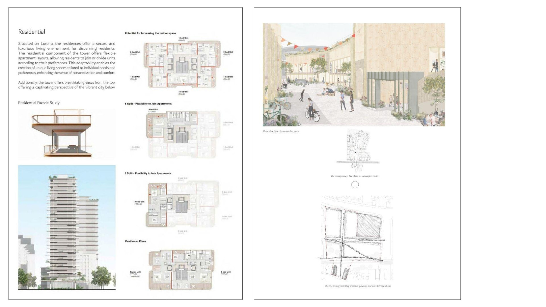
Do this: Include concise text explaining your role, project challenges, and your problem-solving process. Use a consistent layout that allows for both images and explanatory text.
Don’t do this: Rely solely on images without providing any context or explanation. Avoid long, dense paragraphs that are likely to be skipped by busy reviewers.
Pro Tip: For each project, create a brief “project summary” section that includes key details like project type, location, size, and your specific role. This provides quick context for reviewers.
4. Showcase Your Design Process

Process work is gold. It shows how you think, how you solve problems, and how your designs evolve from concept to final product.
Karen notes, “I want to see that you can think through a series of designs or have thoughts. I’m not worried about having messy drawings in there as well.”
Do this: Include sketches, working drawings, and process work to demonstrate your design thinking. Show the evolution of your ideas from concept to final design.
Don’t do this: Present only final, polished renders without any insight into how you arrived at the solution.
Pro Tip: Create a “process spread” for each major project, showing key stages of development. This could include initial concept sketches, study models, diagrams, and final presentations.
5. Effective Use of White Space
While it’s tempting to showcase every detail of your projects, strategic use of white space can significantly enhance the visual impact and readability of your portfolio. When used effectively, it can guide the viewer’s eye, create hierarchy, and allow your work to stand out.
Do this: Use white space strategically to make your portfolio more visually appealing and easier to digest. Ensure your layout breathes and allows the viewer’s eye to rest.
Don’t do this: Overcrowd pages with too many images or text, making it difficult for reviewers to focus on key elements.
Pro Tip: Consider using a grid system to organise your content and maintain consistent white space throughout your portfolio. This can help create a sense of rhythm and balance, making it feel cohesive and professional.
5. Show your technical ability
In architecture, the ability to convey complex technical information is just as important as aesthetic design skills. Your portfolio should demonstrate not only your creative vision but also your technical expertise. However, presenting technical details can be challenging – you need to showcase your knowledge without overwhelming or boring your audience. The key is to strike a balance between professionalism and creativity, making your technical prowess accessible and engaging.
Do this: Find creative ways to present technical information that engage the viewer. Use colour, diagrams, and infographics to make complex information more digestible.
Don’t do this: Present technical drawings in a dry, uninspired manner. Avoid using jargon without explanation.
Pro Tip: For technical projects, create a visual “key” or legend that explains different elements of your drawings. This helps non-technical reviewers understand your work while showcasing your attention to detail.
How to make your work stand out
Now that we’ve covered the essential components, let’s dive into some advanced techniques to take your portfolio from good to great:
1. Craft a compelling narative
Your portfolio should tell a story—not just of your work, but of who you are as an architect. A clear narrative arc can make your portfolio more compelling and memorable.
Pro Tip: Write a brief (1-2 paragraph) design philosophy statement at the beginning of your portfolio. Reference this philosophy subtly throughout your project descriptions to create a cohesive narrative.
2. Demonstrate versatility
While it’s important to show your strengths, also demonstrate your ability to work across different scales and project types.
Pro tip: For each project in your portfolio, highlight a unique challenge you faced and how you overcame it. This could be a site constraint, a client requirement, or a technical issue. By showcasing different problem-solving approaches across various project types, you’ll demonstrate not just your versatility in design, but also in critical thinking and adaptability.
3. Highlight collaboration and leadership
Architecture is often a team sport. Show your ability to work with others and lead when necessary.
Pro Tip: Include a brief section on each project team, highlighting your specific contributions and how you collaborated with others.
4. Use consistent branding
Treat your portfolio as a design project in itself. Use consistent colours, fonts, and layouts throughout to create a cohesive brand identity.
Pro Tip: Create a style guide for your portfolio, defining your colour palette, typography choices, and layout grids. This ensures consistency even as you update your portfolio over time.
Common mistakes to avoid (and how to fix them)
Even the most talented architects can fall into these common traps. Here’s what our experts say to watch out for:
1. Own your work
It’s crucial to highlight your personal impact in project work. Your portfolio should clearly communicate your specific role and achievements.
Do this: Use confident “I” statements to show ownership. Be specific about your contributions, e.g., “I designed the façade system that reduced energy consumption by 30%.”
Don’t do this: Overuse “we” statements that obscure your individual input. Avoid vague descriptions that don’t clarify your role or impact.
Pro Tip: For each project, include a concise “My Role” section with bullet points of key responsibilities and achievements. Use strong action verbs to start each point, emphasising your active contributions.
2. Edit, edit, edit
As Karen advises, “A key skill lies in editing your work and just nailing those few images that tell the most story rather than piling it in and overgiving.”
Do this: Be selective with your projects and images; focus on quality over quantity.
Don’t do this: Include every single image or detail from each project.
3. Get the the Basics Right
In the pursuit of creativity, don’t forget the fundamentals of good design and clear communication.
Do this: Ensure your portfolio is well-organised, easy to navigate, and free of typos or grammatical errors.
Don’t do this: Use experimental layouts or fonts that prioritise style over readability.
How to fix it: Ask a non-architect friend to review your portfolio. If they can easily understand and navigate it, you’re on the right track.
4. Update Regularly
Your portfolio should evolve as your career progresses.
Do this: Set regular times (e.g., every 6 months) to review and update your portfolio.
Don’t do this: Use the same portfolio for years without refreshing its content or design.
Pro tip: Create a digital “master” portfolio with all your projects. This makes it easier to swap projects in and out as needed for specific applications or as your work evolves.
Final Pro Tip
After you’ve updated your portfolio, practice presenting it. Your ability to discuss your work confidently and articulately is just as important as the portfolio itself. Consider recording yourself or presenting to a friend to refine your presentation skills.
Creating a knockout architecture portfolio is both an art and a science. It requires careful curation, thoughtful design, and a clear understanding of your audience. By following these expert tips and avoiding common pitfalls, you’ll be well on your way to crafting a portfolio that not only showcases your abilities but also leaves a lasting impression on potential employers or clients.
Now go forth and create a portfolio that truly represents your unique talents and vision as an architect. The world is waiting to see what you can design!


Looking to hire top talent
 or advance your career? Let's talk.
We connect exceptional firms with talented professionals.
Whether you're looking to hire or explore new career opportunities, let’s discuss how we can help you achieve your goals—get in touch today.
Related Posts

Every employee has one thing in common: they’ve experienced the ‘interview.’ Whether you love them or hate them, they’re an essential part to any application process.
The Bartlett In-Person Postgraduate Open Evening
Discover The Bartlett’s renowned postgraduate programmes during this informative evening with faculty and student insights.
The Architecture Symposium, Sydney
The Architecture Symposium is a Design Speaks program organised by Architecture Media.
